Marketing Lab
Designing a fun way of learning digital marketing online.
Timeline
Aug - Sep 2021
Platform
Web App
Role
Product Designer
Introduction
Introduction
BT is a Marketer building a personal brand online by sharing his experience. He creates highly insightful content targeted at entrepreneurs and less experienced Marketers, to share a better perspective of what Marketing is and how successful companies have been using it. He does this by creating case studies that are short, practical and actionable, as opposed to the usual BS that reigns in the industry.
A lot of his subscribers rely on this content to learn valuable marketing insights that they apply in their own jobs or businesses. With this project, we set out to design a better learning experience for readers and anyone getting into Marketing, and explore the business opportunities that come along.
My role
I led the design on this project from end to end. I collaborated throughout the project with a small team composed of a web developer and Beni himself as the client and marketer.
Problem
After months of consistently creating content on his socials and newsletter and interacting a lot with his community, Beni noticed a few repetitive pain points both for him and his audience, that would eventually end up creating the need for this project.
Content distribution The content is spread across multiple platforms and there's nowhere readers can easily find it. Everything that's posted disappears in feeds a few days later, turning into a loss for the brand.
Marketing education For beginners looking to get into Marketing, there's no guided and structured way to learn the basics and key concepts online. Classic blogs are just an overload of information that's confusing to digest, resulting in most people wasting time looking for advice on what to learn and when.
Revenue generation Assuming successfully learning the basics would create a desire for some users to dive deeper, there could be a business opportunity in suggesting specific courses to them. How to design an experience that makes it effortless for users to discover and purchase those trainings?
Goals
Based on the identified problems, we defined and summarized together the main mission for this project.
Process
Research
Learning from the existing
Given the short deadlines and tight budget for this project, I couldn't afford to gather new data about the users. Instead, we collected any data that was already available from Beni's interactions with his audience. We went through emails, private chats, written feedback, etc. We looked at questions he had already asked, answers he received often.
After compiling everything, we were able to:
confirm that the problem really existed for marketers
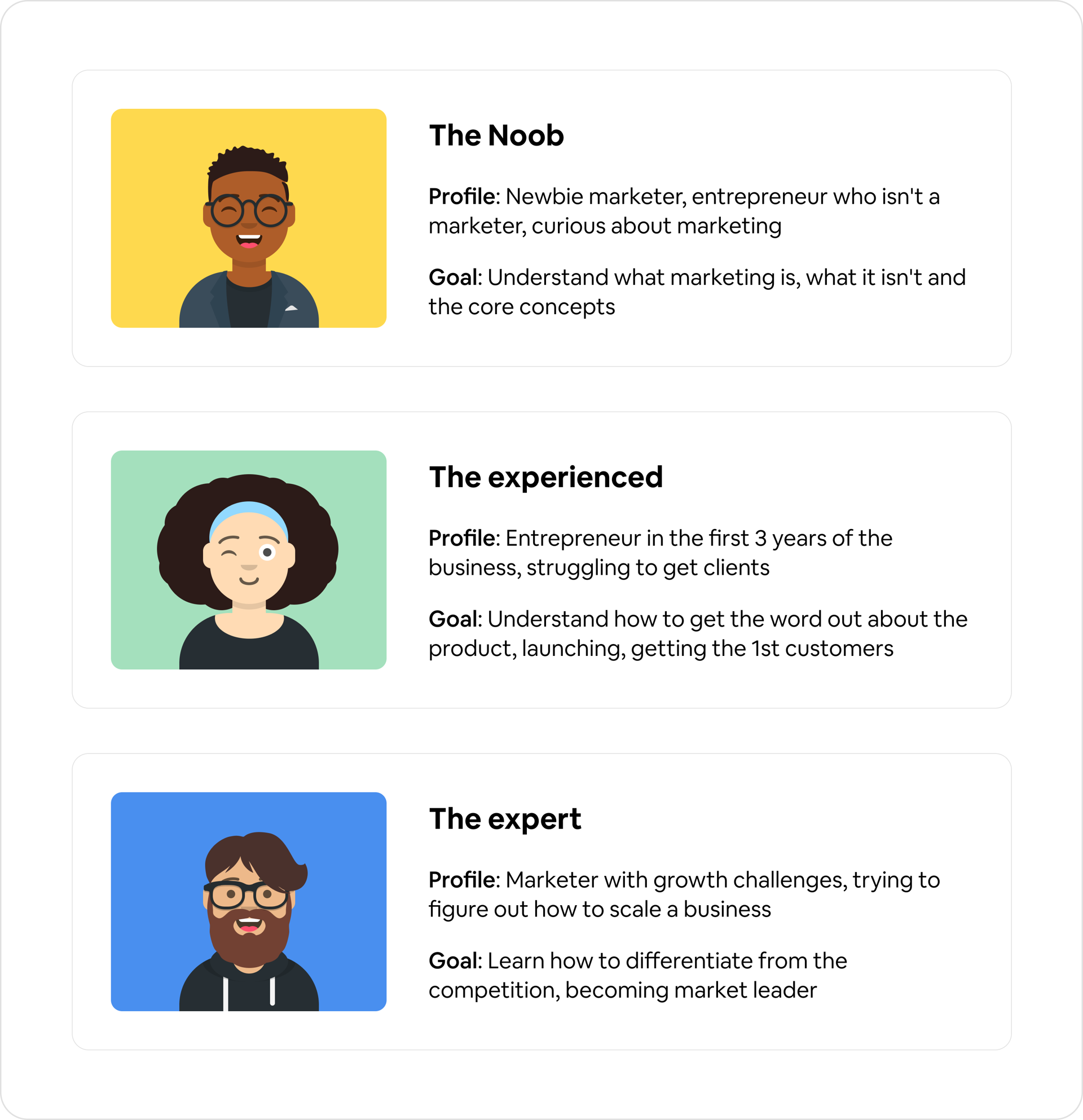
understand the profile of those who experienced it and categorize them
come up with 3 distinct user profiles based on experience and needs.
Competitive benchmarking
Once I had a better idea of what users were looking for, I needed to analyze existing solutions they were likely to come across if they googled their problem. Using Beni's experience on the subject, we quickly pulled out a list of marketing websites that more or less solved this problem.
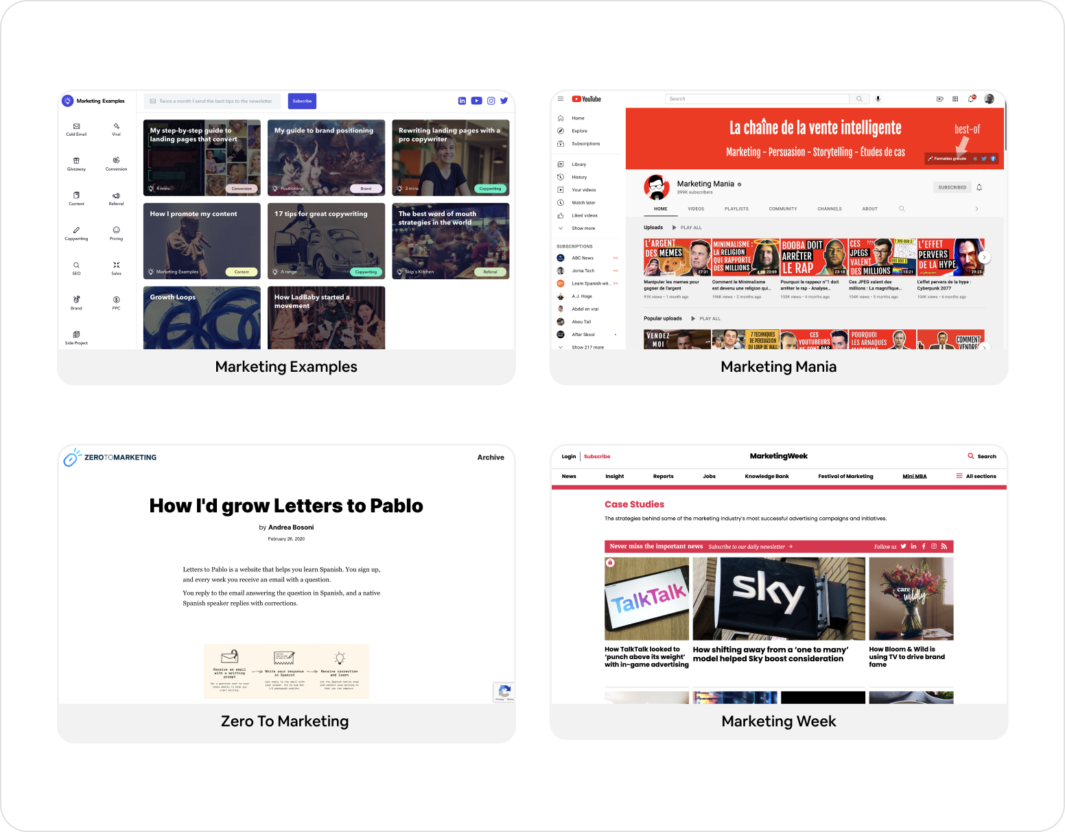
After reviewing the most relevant ones, here are a few things we felt could be improved or fixed:
infobesity for beginners, there's no guidance on where to begin and where to go next
hard to keep track of key takeaways from case studies
lack of small, cheap courses that teach specific subjects in depth
clustered Ui and visual style, not favorable for learning
very few resources are available for francophone learners
Ideation
Brainstorming
This step was executed with the client, as a long chat between the two of us. We discussed the challenges extensively, while taking notes and moving the conversation towards any interesting ideas.
Eventually, we started discussing gamified experiences and how they could create a more enjoyable and productive experience for readers to learn with Beni's content. This sounded interesting, so I decided to develop it into something more solid.
Mood board
Looking for inspiration is the best way to polish a seeding idea. To make my search for inspiration effective, I defined a few criteria that'd apply to whatever I ended up creating. I then went to search and test apps that fit some of those criteria.
For example, some of the apps that I tested were games from Method.ac, which had in common that they were browser friendly, easy to play and required no sign up.
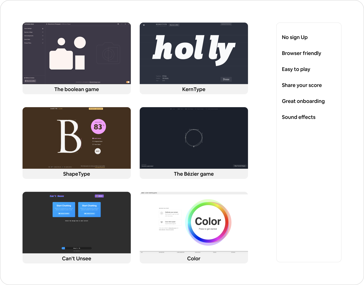
Other apps include Can't Unsee, a "Spot the difference" type of game to learn Ui best practices and Uxcel, a web app to learn Ux design with a full game experience.
Initial proposition
Combining the different information from the previous steps, I was able to craft a first draft of what our learning experience could look like. In simple terms, here are points that summarize my initial idea of the flow:
By default, visitors would land on a classic blog page with Beni's case studies. Here, they can freely browse the content and filter by categories.
They'd have a button on the page to switch between the blog and an "Academy mode"
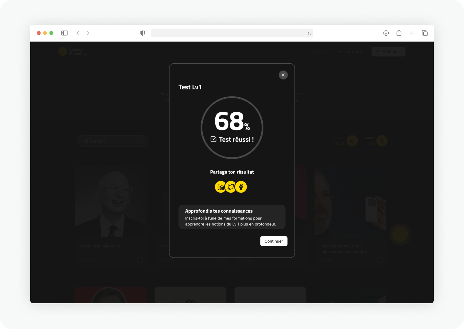
In the Academy, everything is organized in levels rather than categories. Each level features a selection of content tailored for a specific user profile. After completing a level, completion quizzes asses a user's understanding of key concepts before they can move up. This step is basically where the game happens.
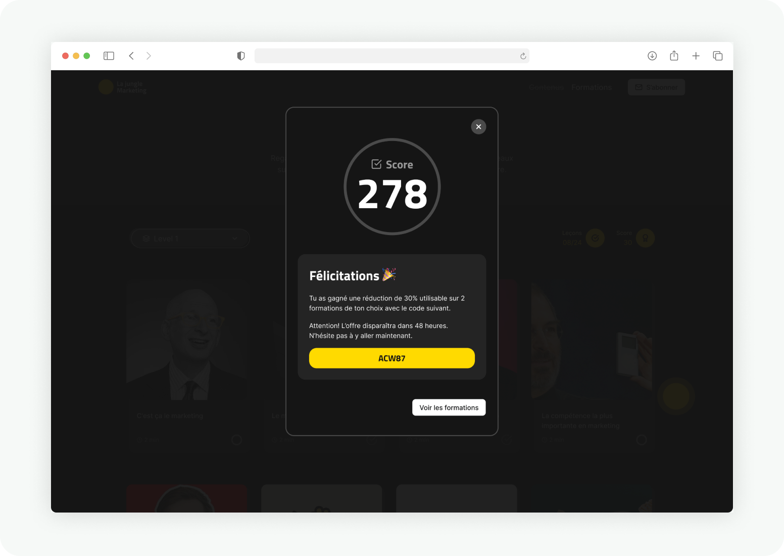
Succeeding at completion quizzes updates a user's score and rewards them with discounts that they can apply to buy some of our trainings. The higher the score, the higher the reward.
What made this the ideal solution was that it offered opportunities to connect the different parts of a user’s journey and touched on each of the 3 challenges of the project.
Structuring
Information architecture
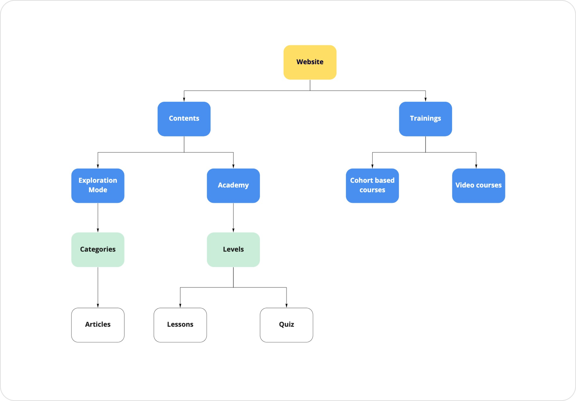
I created a simple sitemap to visualize how the website pages would be structured.
At the top, I put a page for contents and another one for trainings, representing the two main types of contents on the website: case studies and courses.
The blog and the Academy are siblings in the hierarchy to communicate that they're pulling from the same content, presented and organized differently: categories in the exploration mode and levels in the Academy.
User journey map
The most challenging aspect of this project was drafting the happy path that would lead a user to get full value from the product. Based on the initial goal of our users, we sequenced the ideal journey in 4 steps, from their first contact with us to achieving that goal.
For each step, we defined the actions a user would take, the key elements that would help them move to the next step and which parts of the product they'd interact with.
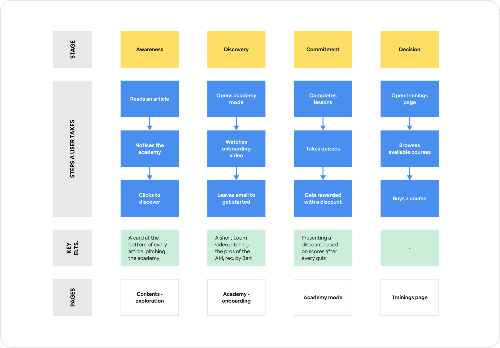
We then refined our story of the user's journey over multiple iterations until getting to a flow that felt simple to navigate. The final flow breaks down like displayed on the user journey map.
Prototyping
Sketching layouts
Sketching is a crucial part of my prototyping process because it allows me to put ideas to test with constraints that apply to a web page.
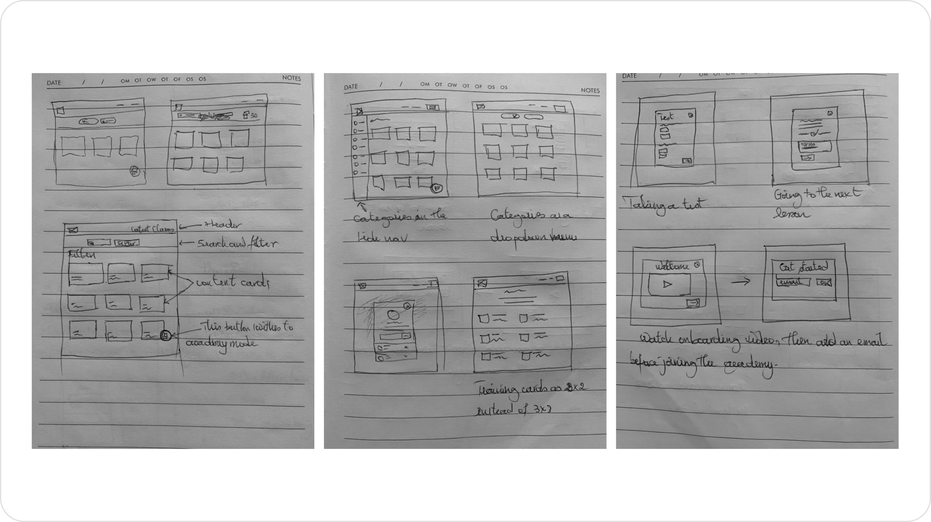
With pen and paper, I drew multiple layout variations for each of the pages, tested different ways of presenting the content. At the end, I had a few concepts that looked promising and worth testing.
Setting the stage
When creating a new Figma file for a project, I always make sure to structure its pages in a way that reflects the different stages of my Ui design process.
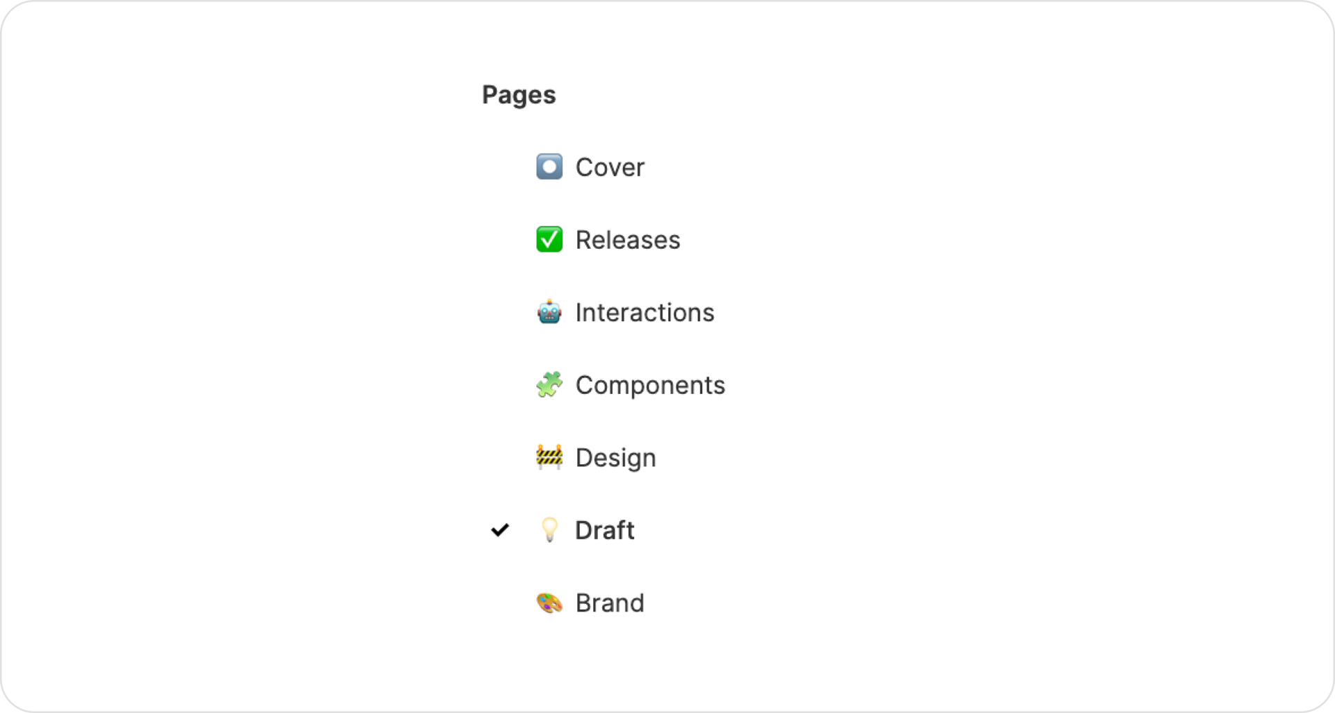
Here for instance, I first created a quick board with different elements from the existing visual brand, to help set a tone for the Ui style and components. Then I moved to the Drafts page where I reproduced and tested some of the layouts from my sketches.
Designing the Uis
Since I don't believe in grayscale wireframes, I apply an iterative approach to building Uis. This means for every screen, I have to test multiple variations of styles, discard anything irrelevant along the way and watch the page take shape.
I use the drafts page as my playground and move anything that looks fine to the Design page so it can be put in more context and refined.
Contents
Once the prototype was validated with the team, I spent some time crafting the Ui copy. I made sure it was engaging, concise and informative, to match with the existing brand’s tone of voice.
A last element of the information architecture that couldn't be overlooked was content organization. On the blog page, articles were organized in categories. So we decided categories would represent the main subject that's being discussed in an article.
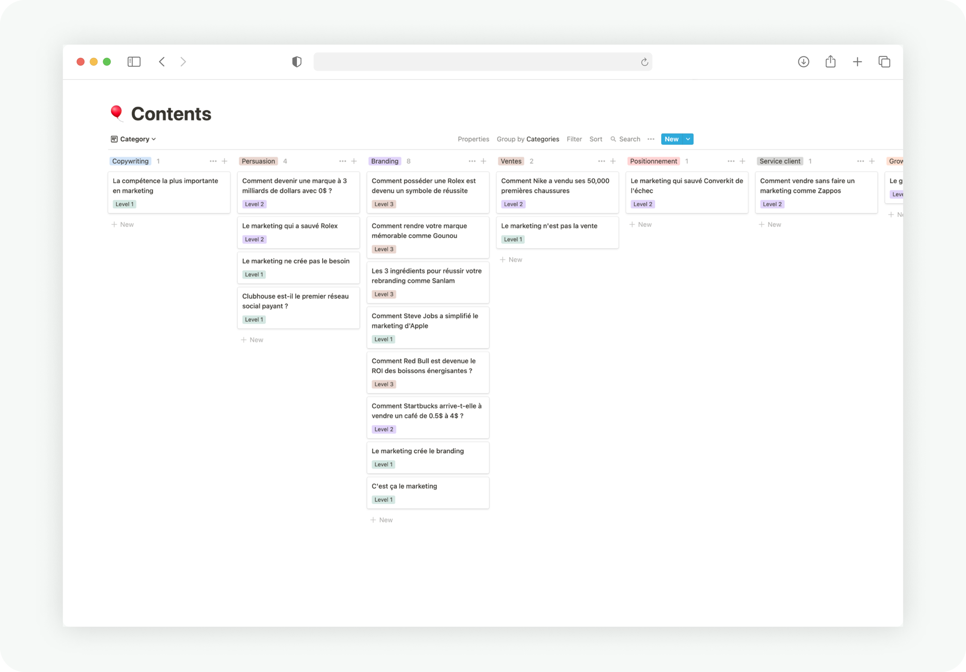
However in the Academy, only a selection of content would be displayed for each level. We decided the content for each level would fit a specific user profile from the list above.
Final designs
Walkthrough
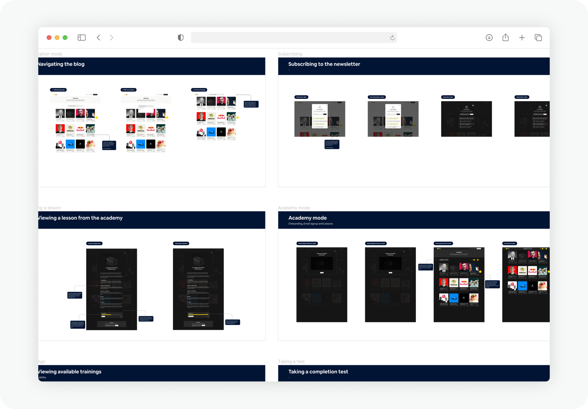
Viewing a case study
As described above, the Exploration Mode was designed to look like a classic blog so first time users won't be confused when landing on the main page.
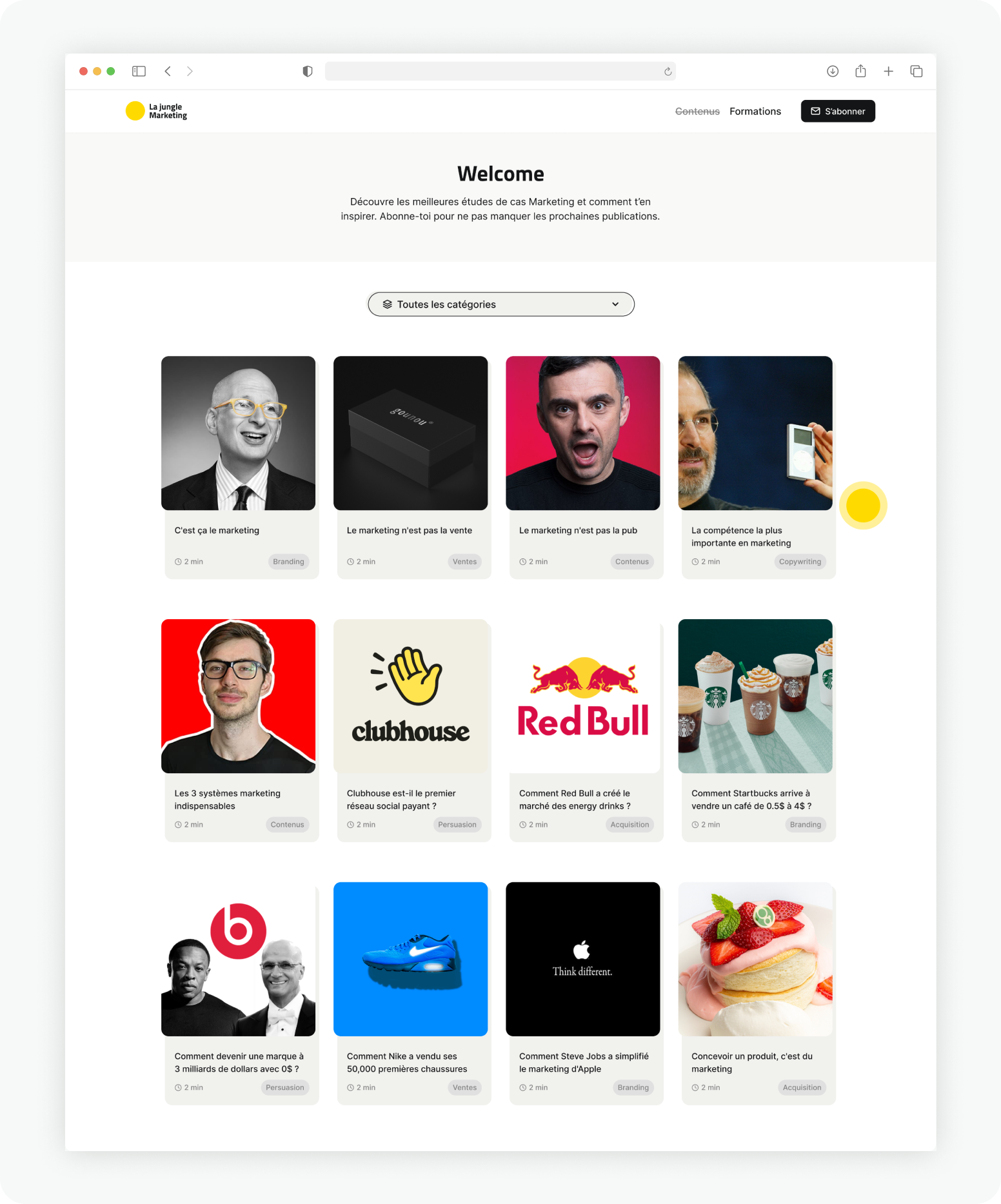
Clicking an item on the page opens a pop-up window, rather than a new page. I assumed users were likely to read more case studies in a row if going back and forth between the list and the detailed view felt short and quick.
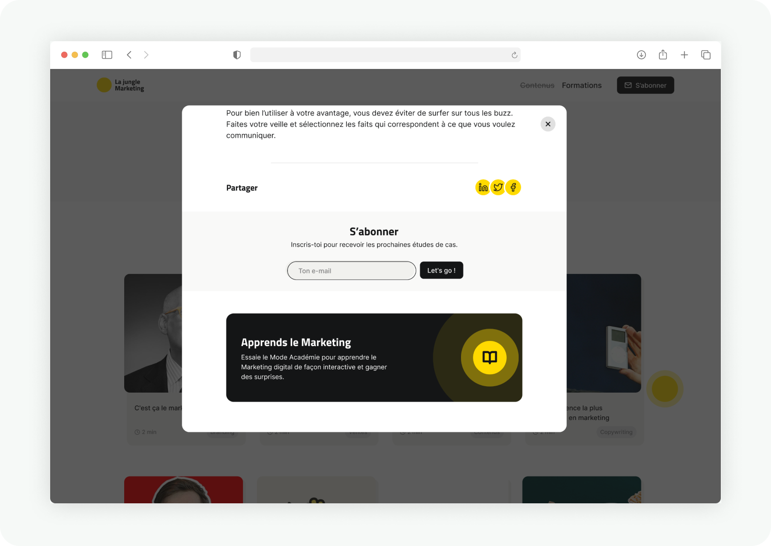
At the bottom of the detailed view, there's a very hard to miss card that introduces the Academy mode.
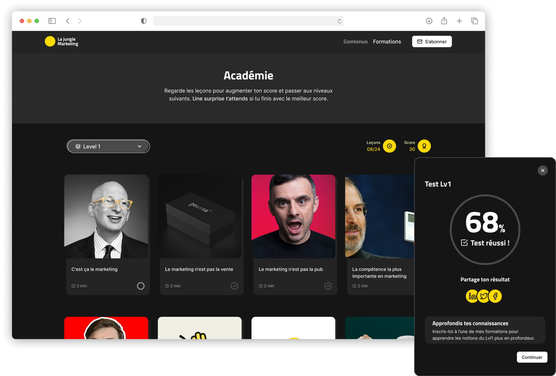
Navigating the academy
In the Academy mode, the color theme changes from light to Dark. This difference expresses to a user that they've entered a new zone with different rules, and is also highly inspired by the color theme of most games on my mood board.
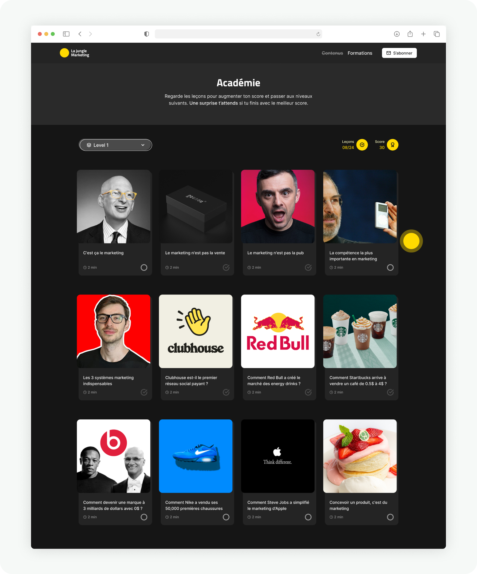
In the Academy, users can actually use the dropdown input to change their level. But choosing a new level triggers a quiz that they'll have to complete before stepping up.
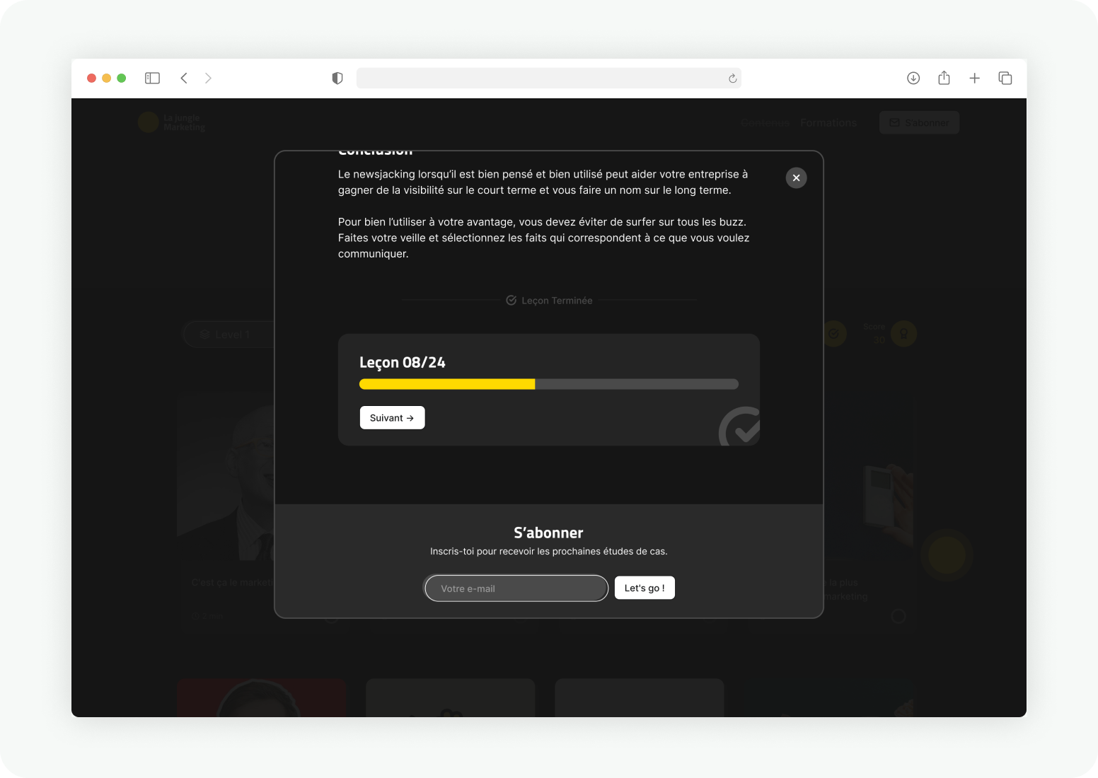
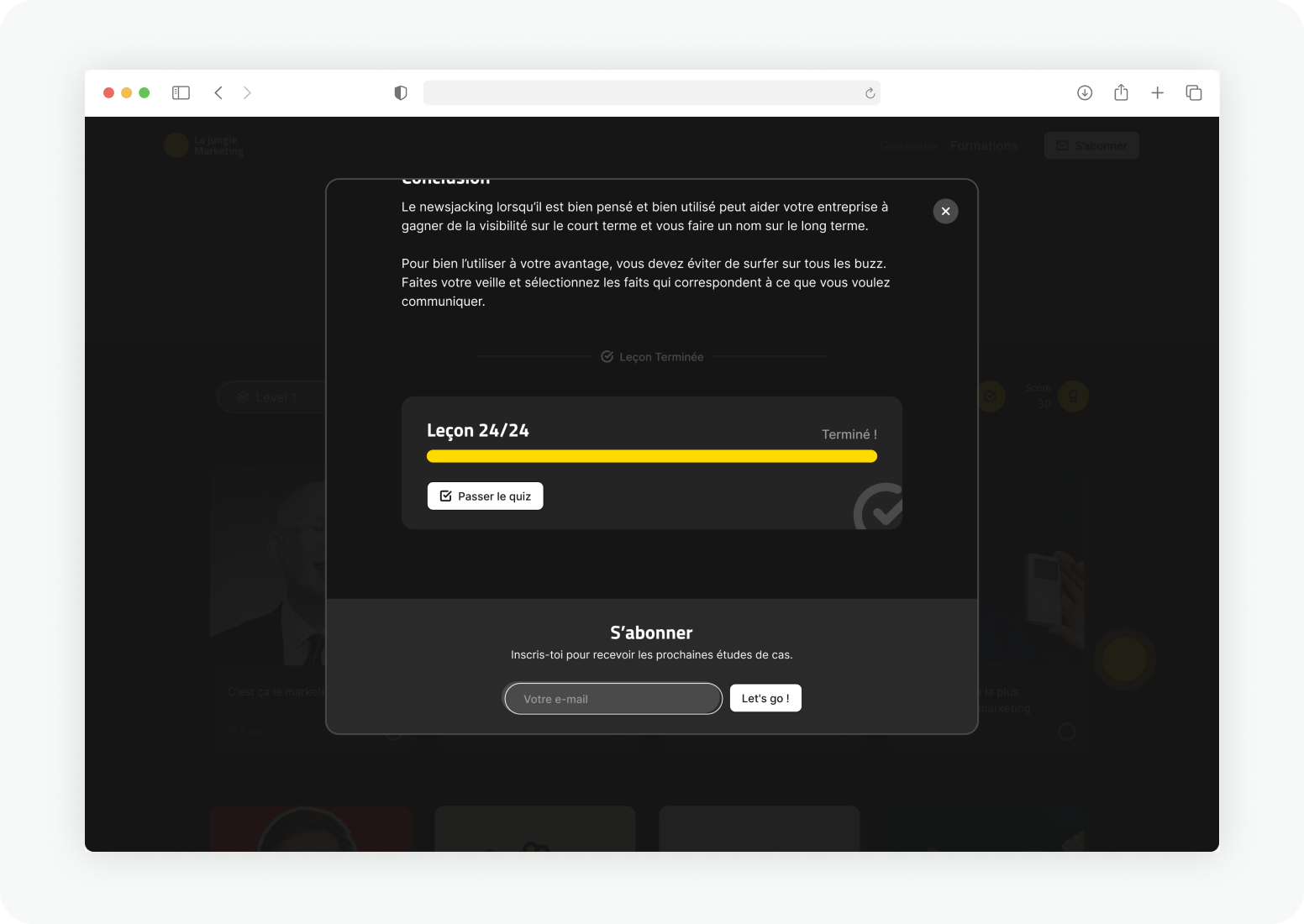
At the end of every lesson, it's easy to know what action to take next.
Getting rewards
Users get rewarded with discounts when they've successfully completed a quiz.
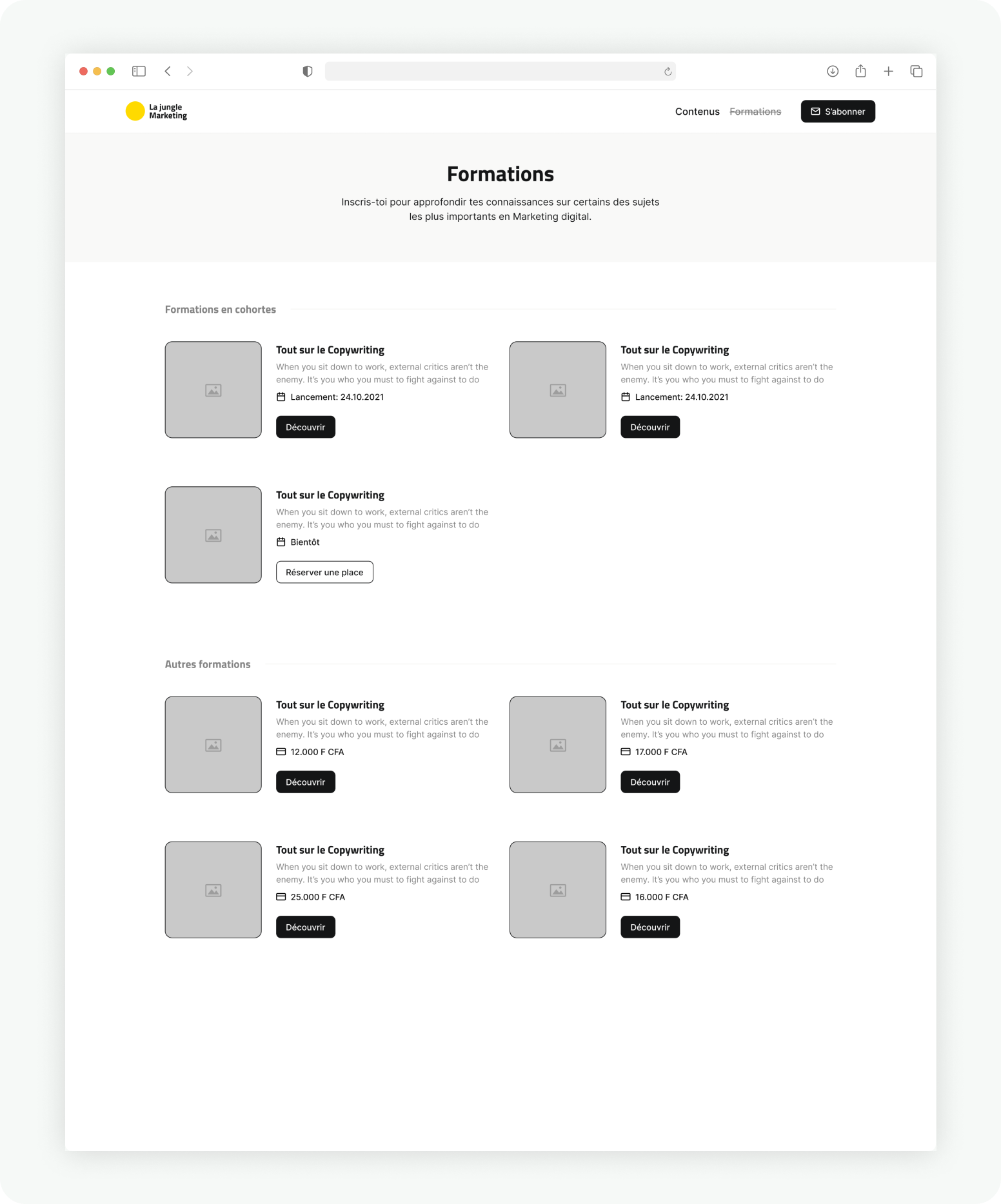
Buying trainings
The trainings page lists all the available paid courses from the client. The call-to-action buttons here will redirect to a dedicated sales page for each course.
Handoffs
After the work is done, handing off usually implies cleaning up and preparing 3 sets of elements:
Styles: going back through all the UIs, I carefully organized text and color styles, reviewed my color palette for light and dark modes and font styles.
Components: I created responsive Ui components with variants and made them interactive using Figma's demo feature.
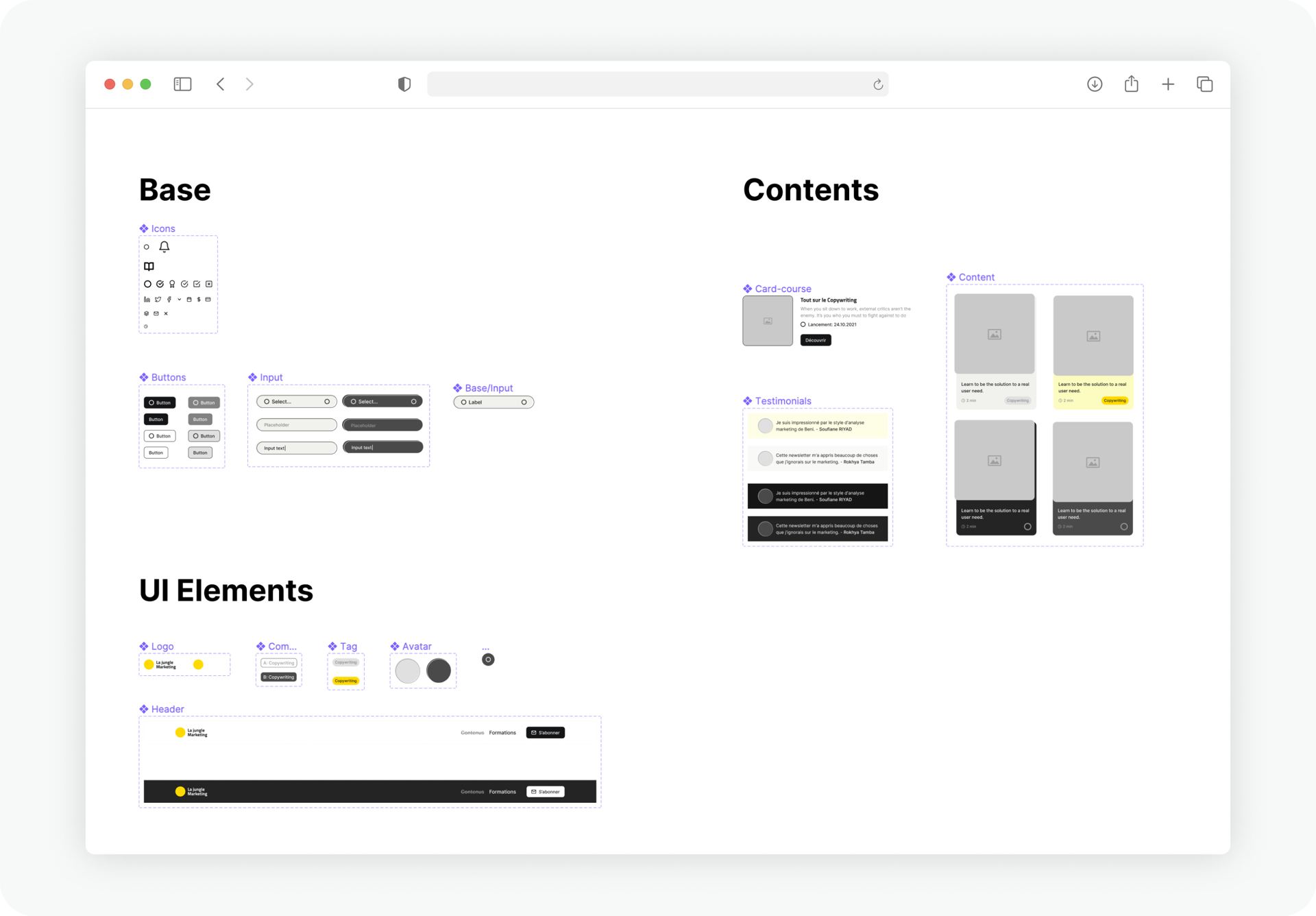
Releases: Here, I organized the different screens based on user flows. I hand these to the developer with a detailed list of all the user flows, followed by a few specifications that don't appear on the UIs.
Future steps
Considering we've worked with very little user input throughout the project, it is safe to say this version of the Ux is likely to go through significant updates and iterations once it's released.
At this point, it is very exciting to see how much more can be done to improve something like the academy mode. For example, one of those things that deserve more attention is the way we test users. Although quizzes are nice, they don't fully embody the vision of this as being something practical and actionable.
It would be interesting on a future project, to find ways to make that specific part more interactive by putting people in front of real cases studies themselves, where they can try to apply some of the strategies that they have just learned.
check more projects
Naël Mahouton
© 2020 - 2021, all rights reserved.